Simple ways to make the most of your printing
Printing. So, you stick a few bits of clip art to a word document, add some funky text and send it to the printers to produce, right?
Not quite. If you want your print to stand head and shoulders above your clip art counterparts, you need a bit of know-how. And it’s not as difficult as you think.
Consider your target market. Does the design and style appeal to them? Is the text easy to read? Everything that we print for our clients has a purpose. Whether it’s a large format graphic, a catalogue, mailer or membership pack – they all have a required outcome.
This should be the main focus when specifying your job.
Sizing
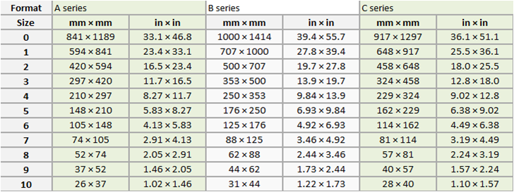
What size do you want your print job to be? Popular sizes are the A series, e.g. A4, A3. This series is a standard trimmed size. B series are untrimmed and accommodate the C series envelopes. The C series are the sizes for envelopes used with the A series. This set of series is monitored by the international paper size standard ISO 216.

Bleeds
A bleed allows graphics and blocks of colour to “hang over” the edge of the document to ensure no white lines when the paper is trimmed. If you do not allow for this, any misalignment of the paper will result in your artwork not running to the edges. A 3mm bleed is sufficient for most artwork. Before starting your artwork, set these first. Print buyers and graphic designers will love you if you use bleeds!
Fonts and Artwork
Artwork can be lost and sometimes a font will be substituted if it is not available on another PC. To lower the risk of this happening, save your finished file as a PDF and add an instructional note detailing the fonts you have used. This will help the print buyer check everything is in shipshape and Bristol fashion.
Colours
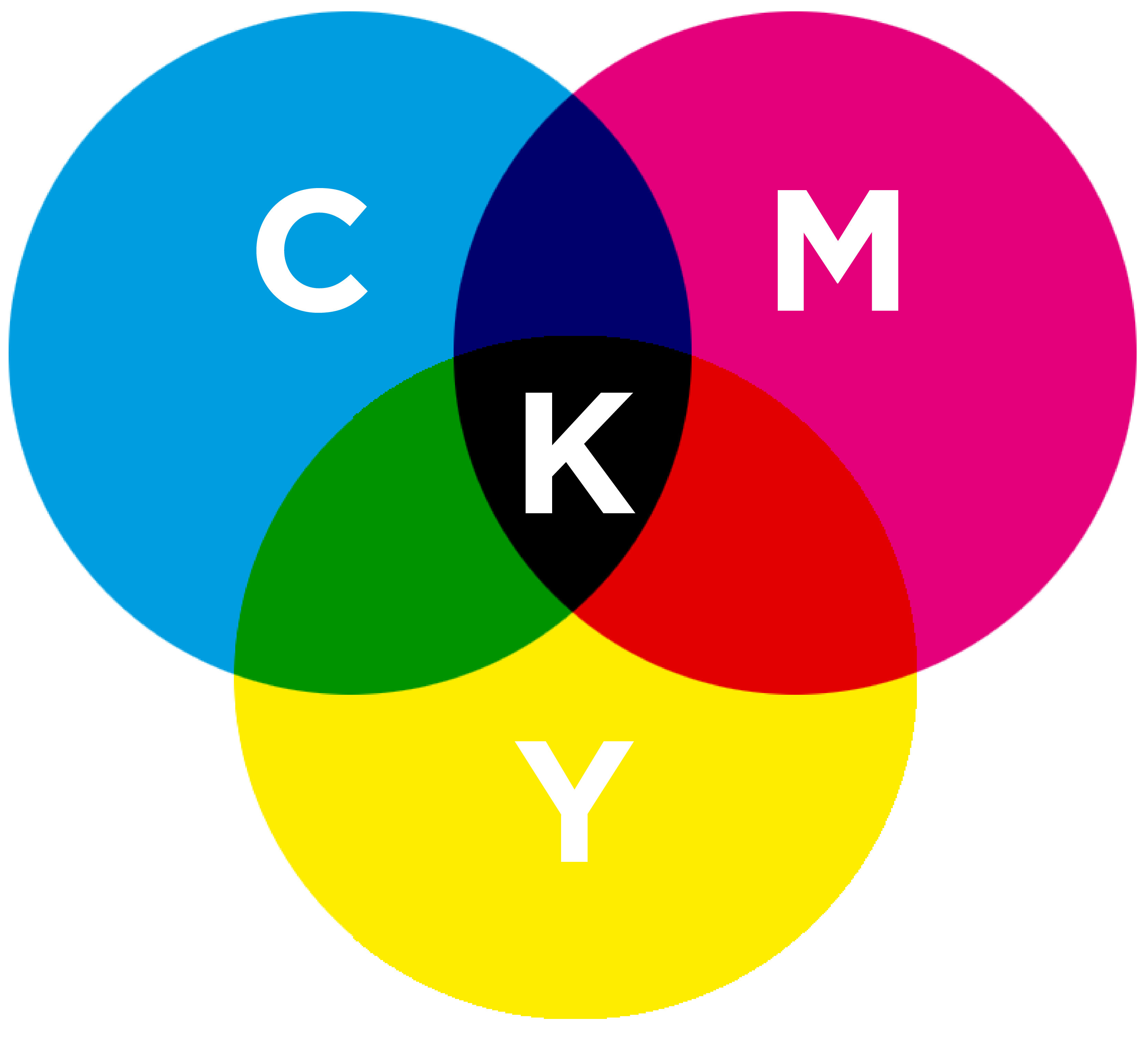
What you see on the screen is often brighter than the printed copy. To help combat this, ensure all colours and images used in your document are saved as CMYK. CMYK is a four-colour process made of Cyan, Magenta, Yellow and Key (black) and will ensure we achieve the best and most consistent results for you.

Proofread
And proofread it again. Spelling mistakes and grammatical errors can be costly and look unprofessional. If your programme has a proofreading tool, use it!
Don’t compromise on quality. Choose your paper with thought. For example; some colours look more vivid on coated paper. For extra pizzazz and flare, consider laminate finishes or digital print enhancements. Or try a bit of sensory marketing.
All of this can be a bit of a razzle dazzle so why not give us a call with your requirements and we’ll give you a hand.


