When Printing Becomes the Fifty First Shade of Grey
Black isn’t always black
Kevin needed a professional finish for his posters as his trusty desktop inkjet doesn’t quite make the grade. So, he saved up his pennies and ordered them online. He was pretty chuffed with his efforts as he had spent several days on Photoshop tweaking bits here and there to make it look just right.
A few days later, his posters arrived. Excited, he tore open the box and reached in to retrieve the print. His excitement turned to confusion; the black areas of the posters were shades of grey. But the images had looked black on the screen, hadn’t they?
Unbeknownst to Kevin, when it comes to printing, black isn’t necessarily black.
Why?
It’s all about knowing your RGB from your CMYK (or as my cousin calls it, your rog-bers from your c-mucks.)
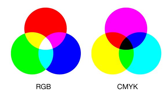
RGB stands for red, green and blue. These are additive colours. This mode creates colours by combining or adding different quantities of red, green and blue and is used for TV and computer screens. Take a closer look at your screen and you will see it thousands and thousands of little red, green and blue dots. The more of red, green or blue you add the brighter the colour becomes so when you combine all three, you get white. When you create black using RGB, this still contains light. Try it on your screen and darken the room. If it was a “true” black, you wouldn’t see the screen at all – but instead, the screen will glow as there is light present.

Where RGB adds light, CMYK subtracts it. Professional printing companies use CMYK (cyan, magenta, yellow and key/black) because these colours absorb the light that hits the paper and the white of the paper itself. But simply using 100% of K (black) and nothing else, you will end up with a very, very dark grey when your artwork is sent to print. You need to mix the four colours to achieve a true black; if you used C=40 M=30 Y=30 K=100 this would give you rich black that looks “true” when printed.
Our mate, Kevin, used Photoshop to create his design. This programme is set to RGB as default. His mix of black contained light. If he had changed the default to CMYK, he could have mixed a richer black to blend with the images on his poster. Rule of thumb – if you are designing for screen, use RGB. For print, CMYK. Always check the settings before you start your design and never, ever use the ‘Registration’ swatch to create your artwork as its 100% of C, M, Y and K. Not only will you waste a lot of ink, but it will sit on top of the paper and take an age to dry.
We automatically check designs and artwork for you to ensure you get the best from your print. It’s all part of our service to you! If you have questions just call and ask – it’s good to talk ???? 01543 257257


