Doing the Brochure Thing
Making the Best of your Brochure
Brochures are great little touch points that provide information about your business services. You can market pretty much anything in a brochure! It’s a mini synopsis in your customer’s hand.
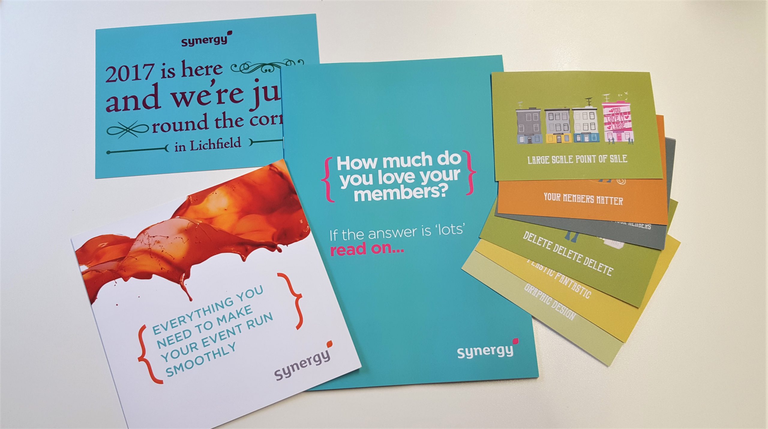
You don’t need to limit yourself to just one either – if you have multiple services, you can have one for each. Here at Synergy, we use several brochures (finished in a lovely soft touch laminate!) and we also utilise A6 and A5 sized postcards (pictured right).
Here are a few of our tips to help you make the most of your brochure.

Write, Cut, Shuffle and Tone
Before you dust off your pen, know what you want the end result to achieve. Bear in mind the type of customer you are writing for and angle the tone to suit.
Now write out your content. Include everything, the full works. Writing it all down ensures you don’t miss out any of the good stuff later on.
Take a break and walk away from your word flurry. Once you’ve had a cup of tea, revisit it as your customer. Would you read all of that? Of course not! Too much information bombards the brain. Keep the bits that highlight benefits to your customer and how your service solves their problem. Cut anything that clouds this. Keep it current, refined and effective.
Shuffle the remaining text so it flows when it is read back. If it helps, read it out loud too – this can identify hidden sins on the page!
Get Personal
Personalisation allows you to customise the content of the print you produce. It captures the reader’s attention as it’s tailored for them. This makes the literature more memorable as the reader develops an attachment to it and in turn, this can increase response rates and therefore, sales!
Pretty As a Picture
Stock photos are great as placement images but they are available to everyone on the web. To stand out, consider photos that are exclusive to your company. Images speak a thousand words so choose your pictures to match the content and style. Use them throughout to hold your readers interest and to direct them to what you want them to read next. Keep the layout orderly to make it easy for the eye to follow the design.
Your front cover needs to jump from the get-go. If your front cover looks OK, you can help make this shine brighter using different printing finishes and techniques (more on this later!).
Play with colours – you don’t have to have a white background.
Fontilicious!
There are hundreds of thousands of fonts out there. Times New Roman and Comic Sans should not just be your go-to fonts of choice. Please. We’re asking ever so nicely. Step away!
The font needs to match your brand and the style and tone of the brochure. They give a voice to the words on the page. Do a bit of research. As a rule of thumb, don’t use more than two types of font and ensure they contrast to give variation and draw attention. Avoid matching fonts or fonts that are too similar as they blend together and make everything look the same.
The right typeface is like a good lipstick – it makes everything look dazzlingly fantastic!
Call to action
Don’t forget to add the important call to action. It’s fine and dandy showcasing your service but forgetting to tell the reader how to find out more or who to contact can lose you prospects and business!
Pimp your print!
You’ve got your text sorted and your images prepped. Now to make them pop! Foil, laminates, gloss, matte, sparkles, embossing, the list is endless.
Dare to do something new with your brochure – compact doesn’t have to be boring. Ask for the brochure to have a different cut to the classic rectangle – try jaunty angles or curved edges, or a totally different shape altogether. Think outside the box.
If you need a hand to take your brochure from good to oh-my-days-pop-your-socks-off fantastic, give us a call on 01543 257257. Bound by a budget? No problem! From content to design to print and mail, we can help you create a lasting impression that matters.


